ASO Creative Gaming Trends
Creative Assets are vital for making a solid first impression, capturing attention, and effectively conveying an app’s essence. Use graphics wisely to engage users and encourage exploration. 50% of users leave the product page within 3 seconds, so we need to maximize user retention. Researching the target market, conducting competitor analysis, and identifying gaming trends are fundamental. Icons are crucial for both Android and iOS users. For Android searches, where users navigate through keywords, icons should represent the app’s purpose and stand out among competitors. However, the icon is even more critical for iOS browse traffic as it’s the primary creative asset displayed in the different sections.
Let’s move into a more precise analysis regarding design trends in gaming in the App Stores that can enhance conversion rates.
You can download for FREE our ASO Creative Gaming Trends guide for all the creative examples and designs!
Table of Contents
Icons
Analyze the use of a main character’s close-up against a clean background in an icon, incorporating elements like a gradient or additional textures such as fire for added depth and context. Action Games emphasize the importance of featuring a character, focusing on intriguing, powerful, and distinctive qualities. Note that the character may not be so famous; however, its ability to be unforgettable and evoke a sense of excitement is crucial. The icon should effectively communicate the themes of battling, fighting, winning, exploring, or the game’s USPs, creating an immersive experience for users similar to that of a movie. You should also test app store icons in order to maximise your analysis.
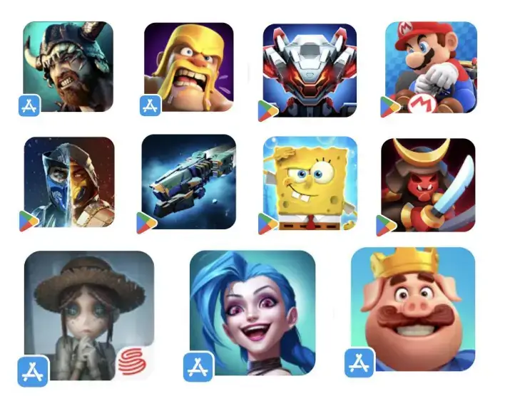
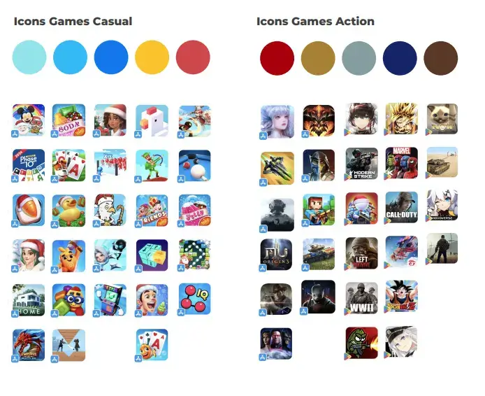
Icons – Action Games
5 out of 10 apps use their logo on the icon, whether they are adding the season number, some particular event information, the developer’s logo, or any other text. Adding the logo/brand name to the icon will usually increase the CVR, enhancing familiarity and security.
Icons – Puzzle Games
Characters are presented in situations where they need help; the user’s help. This increases engagement. Faces and expressions are not smiling and relaxed but stressed, sad, upset, nervous, and desperate. They are in the middle of the action. While describing a complex situation through the app’s icon can involve various details, overloading the small icon with additional items or background elements can eventually hurt the end goal of conveying emotions through explicit creatives. Keep the icon simple and easy to understand, while still capturing a specific context or action.
Icons – Casual Games
Casual game icons use simple, happy designs with familiar characters or game elements for quick recognition. This aligns with the nature of these games, designed to be easy to pick up and play with minimal effort. The icons often show game scenes to give more context.
Icons – Adventure Games
Adventure games are characterized by intricate gameplay, rich narratives, and immersive worlds addressed for a dedicated gaming audience, requiring strategic decision-making and deep engagement. Icons like Minecraft, Roblox, and GTA often adopt darker or desaturated colors, offering a subtle and less revealing visual approach, adding an element of mystery and intrigue to the game’s identity. Adventure games generally convey a less cheerful tone than casual games, with a more serious atmosphere.
Icons – Color Trends
Casual and puzzle games feature vibrant hues and cheerful colors against a blue or light blue background. In contrast, Action Games employs darker, less saturated colors, incorporating shades of brown and dark red to evoke a more realistic color palette reminiscent of real-life scenarios.
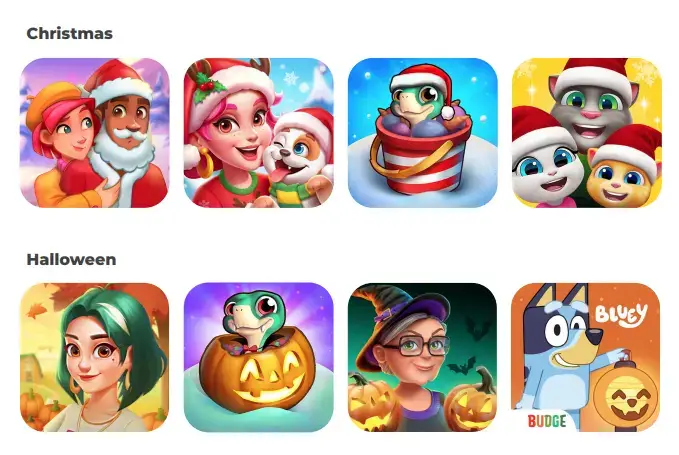
Icons – Seasonality
Marketing campaigns use the increased number of people using the app store during specific seasons, like the winter holiday season including Christmas and New Year’s, or Halloween, to get more attention and engagement. Seasonal marketing often includes special season-themed promotions. Seasonal events are an excellent opportunity to appeal to new and existing users with special promotions. Highlight the app’s updates to show ongoing improvement. Emphasize responsiveness to user feedback and awareness of current events. Assure users that the game remains enjoyable and never dull.
Icons – Ribbon
Competitors often incorporate ribbons into their icons to convey specific information. This can include indicating the current year’s season, specifying the game season (e.g., 3rd, 4th, 5th), or showcasing the developer’s logo. This best practice has been used for many years and only gets some of it!
Screenshots
To design impactful game screenshots, keep these key elements in mind:
- First Impression Matters: Communicate the main message immediately in the first app store screenshot, showcasing the excitement of the gameplay.
- Short and Sweet Captions: Use brief captions to highlight the game’s unique features.
- Consistent Branding: Maintain a recognizable brand focus for a cohesive visual identity.
- Social Activities: Show social features or multiplayer aspects to improve the gaming experience.
- Highlight Main Features: Showcase the game’s USP throughout the set.
- Localizations: Optimize visuals and captions for different countries.
These considerations will help create compelling game screenshots that attract and engage potential players.
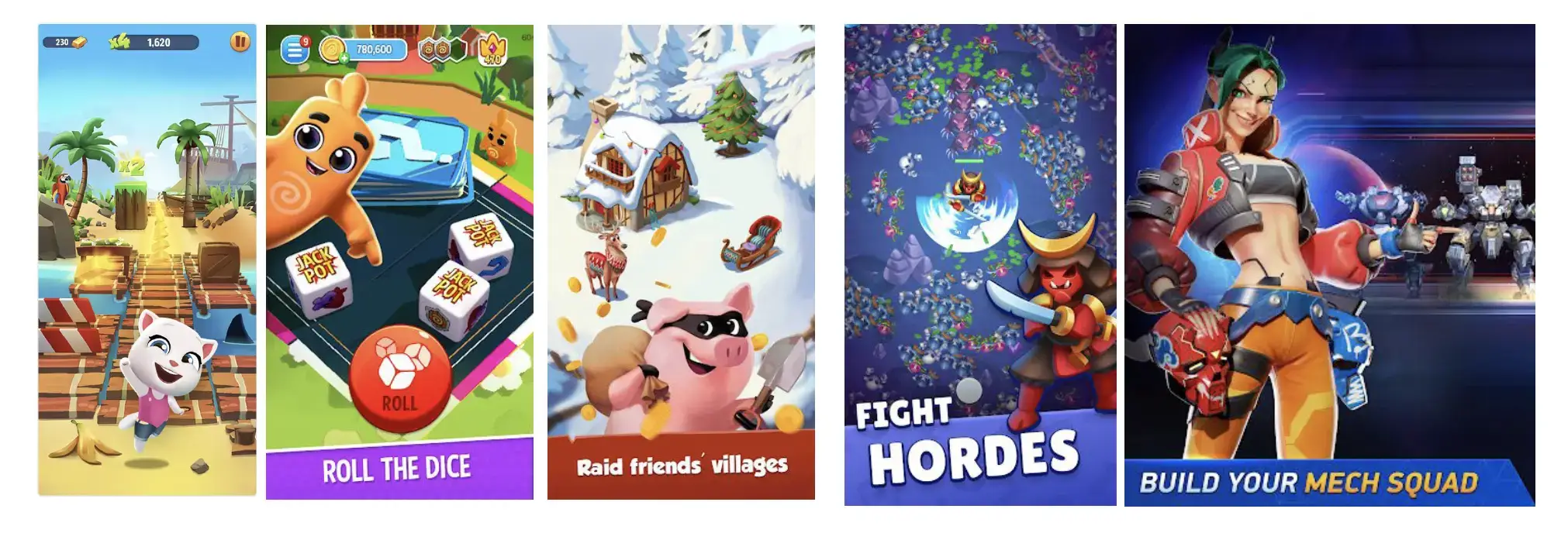
Screenshots – Short Captions & No Captions At All
Spotting screenshot captions using concise texts to enhance user engagement is becoming increasingly common. The text is large and bold, creating a noticeable contrast with the background, ensuring precision, and facilitating easy readability. In adventure or action games, a common trend is to have strong narratives that don’t rely on captions or text. Instead, they heavily depend on the visuals and graphics of the game. It’s crucial to create a strong narrative throughout the screenshots to ensure that players can understand the story without the need for text. Without a well-developed narrative, the game may lack essential information for players to fully engage and comprehend the storyline.

Screenshots – Character Driven
Characters are typically showcased alongside gameplay or highlighting a game feature. This strategy is widely used because it adds to the storytelling through visuals, encouraging users to immerse themselves in the game’s setting. Additionally, featuring the best-performing or well-known characters tends to resonate better with audiences, enhancing engagement. Consider featuring female characters at the beginning of the set, as they are becoming more prevalent in screenshots.
Screenshots – First or Last Poster
Apps and games often use a particular poster screenshot at the beginning or end of their set. This screenshot includes the logo, characters, or a summary with a quick and visually captivating overview of the app’s appearance. It’s usually placed at the end because users often scroll directly there, only seeing the start and end of the screenshots.

Screenshots – Localizations
Localization and culturalization involve tailoring elements to align with the cultural variations of each specific country. Research the different cultural elements that may differ between countries.

Screenshots – Seasonality
Adjust your game’s screenshots based on the season to match user preferences and take advantage of higher download rates during specific times.

Maximize Visual Impact
Games count on eye-catching visuals like illustrations, characters, scenes, and colors. Users absorb information mainly through visuals, so it’s crucial to focus on the visual appeal of creative assets. Designing visually appealing graphics improves a game’s perceived quality, attracting a bigger audience.
In conclusion, creative assets for ASO are crucial and involve:
Researching competitors
Understanding the target audience
Study the specific app category
Investigate the visual gaming industry trends and behaviors of users
Maintain a consistent color palette to attract attention, employ straightforward typography to effectively convey your message, utilize high-quality images recognizable brand elements to build trust.
Your amazing app is just a click away!
Want our ASO team to make your app amazing?
Don’t hesitate to contact us today
You can download for FREE our ASO Creative Gaming Trends guide for all the creative examples and designs!